I have been working with a number of customers who asked for an sFlow vs NetFlow comparison. They were concerned about the amount of visibility they were seeing with the sFlow (sampling) technology and why those reports were so different from their NetFlow reports. In response to all those requests, I set up a lab to show you some of these differences!
sFlow vs NetFlow Comparison: Lab Setup
In the following diagram, Figure 1, you can see my lab setup. I am exporting sFlow from an Alcatel Lucent switch on interface Gigabit Ethernet 1/42 directly to an sFlow collector running on a CentOS Virtual Machine. I have also set up a mirrored port on the switch. Interface Gigabit Ethernet 1/1 is mirrored to interface Gigabit Ethernet 1/42. This traffic is being sent to a NetFlow Probe. The probe is then sending this data as NetFlow version 9 to the NetFlow Collector.
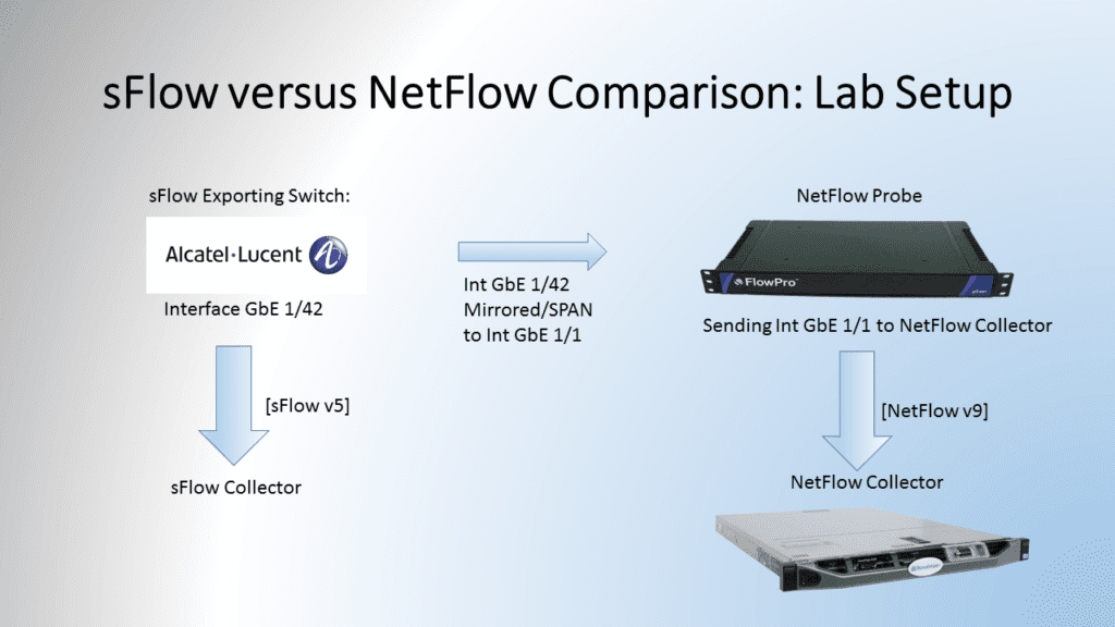
There were many different reports that I could have compared than what I’ve looked at in this blog. With that in mind, I decided to take a look at just basic reporting – bandwidth, top source hosts, top destination hosts, and paired conversations. This type of information should be easy for both an sFlow and NetFlow collector. For all these reports, the same 1 hour timeframe was chosen.
sFlow vs NetFlow Comparison – Bandwidth Comparison
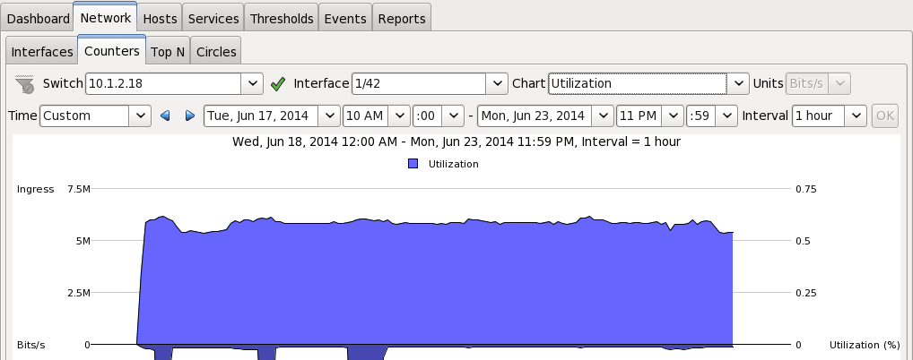
In figure 2, you can see the Bandwidth for interface 1/42 in the sFlow collector. The ingress value is just over 5.5Mb/s for the whole hour.
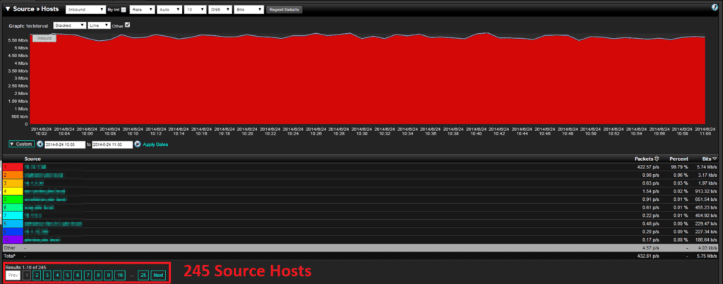
In Figure 3, you can see the Utilization in the NetFlow Graph, and it is right around 5.5 Mb/s. This graph shows almost identical data between sFlow and NetFlow for utilization as we would expect.

sFlow vs NetFlow Comparison – Top Source Hosts
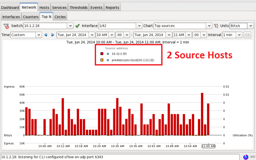
This is where the comparison changes in sampling (sFlow) versus looking at all the data (NetFlow). The sFlow report (figure 4) is showing that only two hosts were sources in this entire hour. How accurate could this be?
When looking at the NetFlow data I see a huge difference! I now see 245 hosts for that same hour! The top talker in each report was the same, but NetFlow will show you talker number 3 through 245. Having this type of granularity is critical in a forensics investigation or threat investigation. How can you trust your data if you aren’t seeing it all?
sFlow vs NetFlow Comparison – Top Destination Hosts
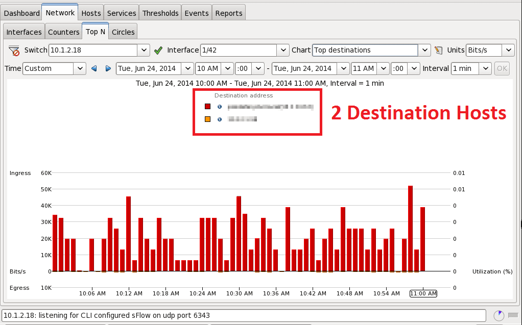
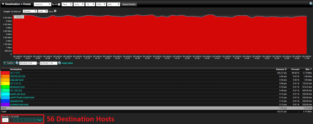
I won’t dive too deep into the destinations hosts reports, as it shows the same results as source hosts reports. The sFlow example for destinations is shown in Figure 6, while the NetFlow example for destinations is Figure 7. The difference is smaller than before, 2 hosts versus 56 hosts.
sFlow vs NetFlow Comparison – Top Pair Conversations
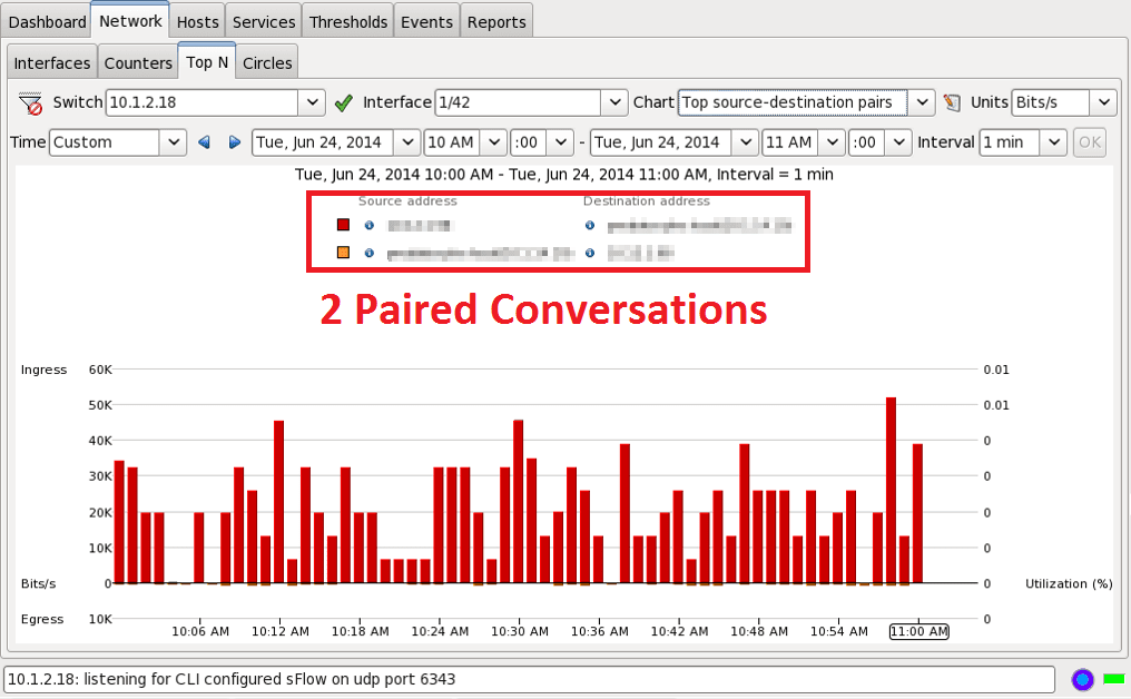
The final report that I want to show is the top paired (source-destination) conversations. I was not sure how this report would turn out after the top source/destination reports. The sFlow report in Figure 8 shows that there were only two paired conversations in the whole hour. I knew at this point that the NetFlow report would show a much larger value.
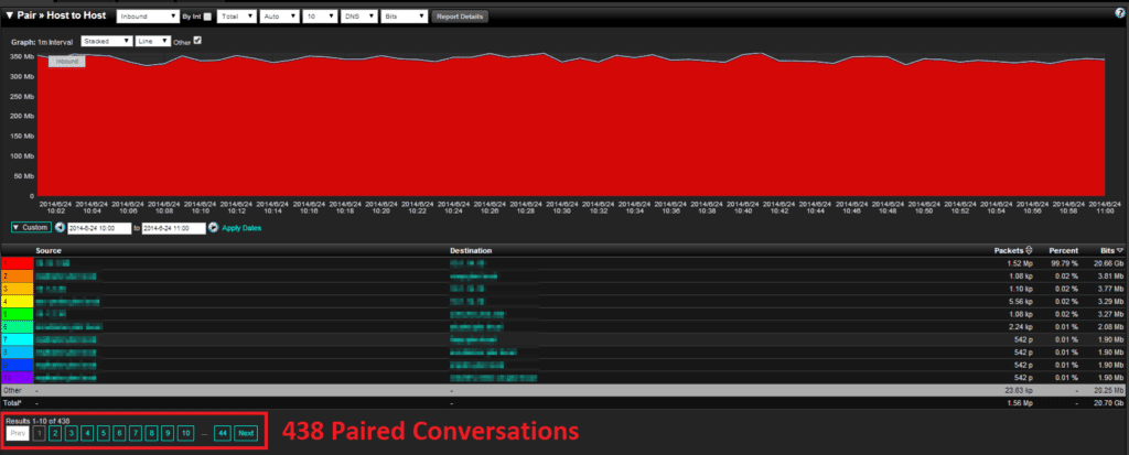
Looking into the NetFlow Paired Conversation report (figure 9), we see 438 Paired Conversations! It seems that every report I run there is a huge difference in the amount of sampled data versus what true accounting is seeing in NetFlow.
What can I do if I have only have sFlow?
If you can only export sFlow, it is still better than having zero visibility. A great way to get around exporting sFlow is to deploy a NetFlow Probe. All that you have to do is send this sFlow vs NetFlow comparison blog to your boss for all the justification you need!
If you have any questions, please reach out to the Plixer Support Team at 207-324-8805 x4


